A rental platform, from zero to launch
Vakansa rents out under-used spaces (offices, cinemas, schools) by the hour or the year. I led research and design to take the platform from an outdated MVP to a launch-ready product.
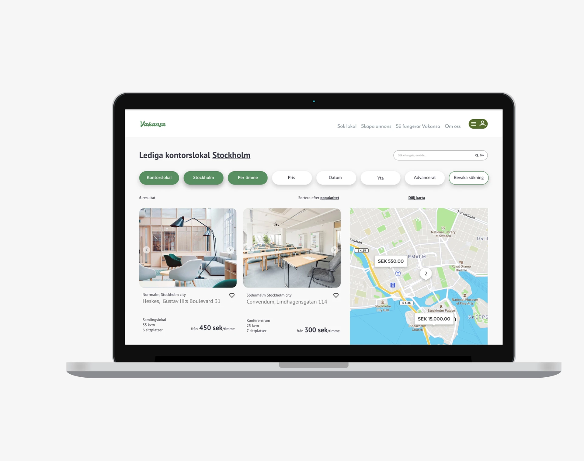
Background & problem
Vakansa is a startup running a platform for renting under-used spaces (offices, cinemas, schools) for anything from a single hour to a long-term contract.
Problem: advertising a venue on the platform was long and confusing, search was limited, and information about membership and pricing was insufficient. Users also felt the platform looked outdated and generic, the opposite of how Vakansa wanted to be perceived.
Target group
Vakansa serves anyone who has or needs a space. On the host side that means companies, schools, and associations; on the applicant side, other companies and associations, but also freelancers and self-employed people. A broad target group meant the design had to work for very different levels of platform familiarity.
Discovering the pain points
I used a user-centered approach to research existing and potential users:
- Conducted interviews with schools, companies, and freelancers.
- Used affinity diagramming to find patterns across the interviews.
- Mapped behaviour types, user stories, and customer journeys.
- Built a requirements sheet and prioritized it.
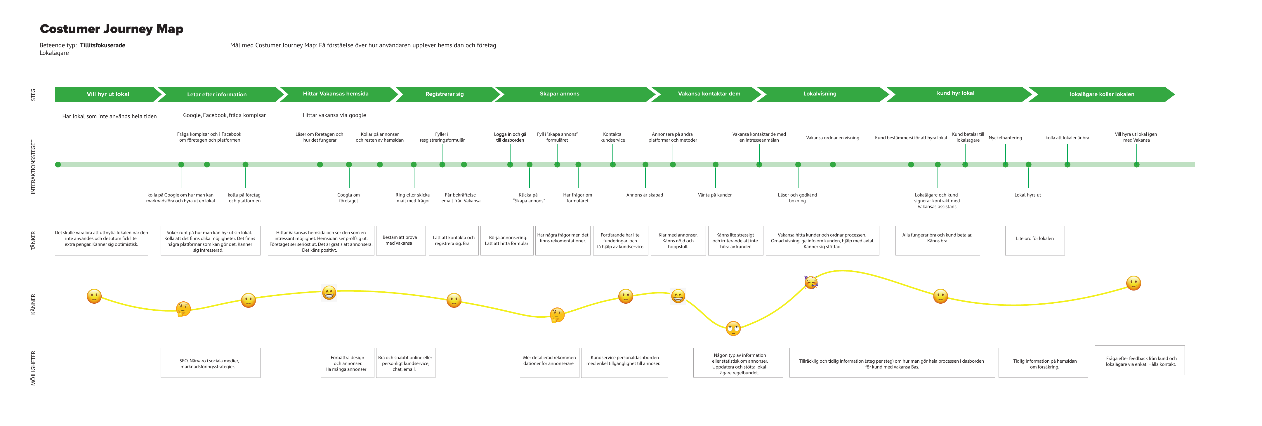
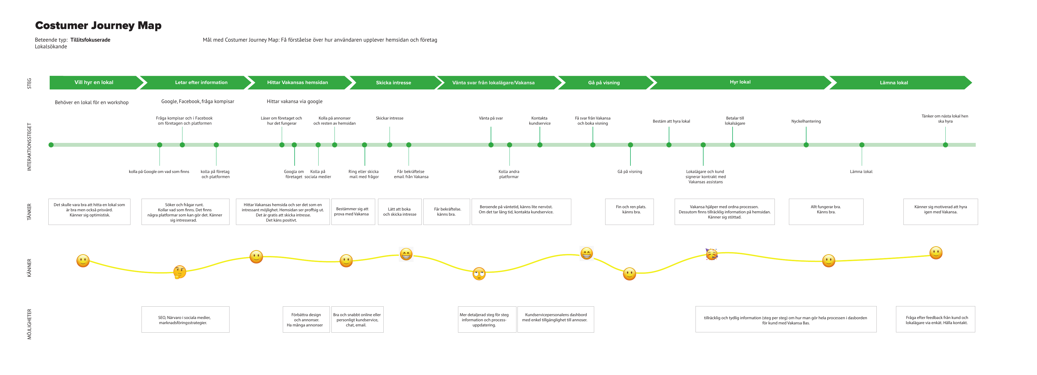
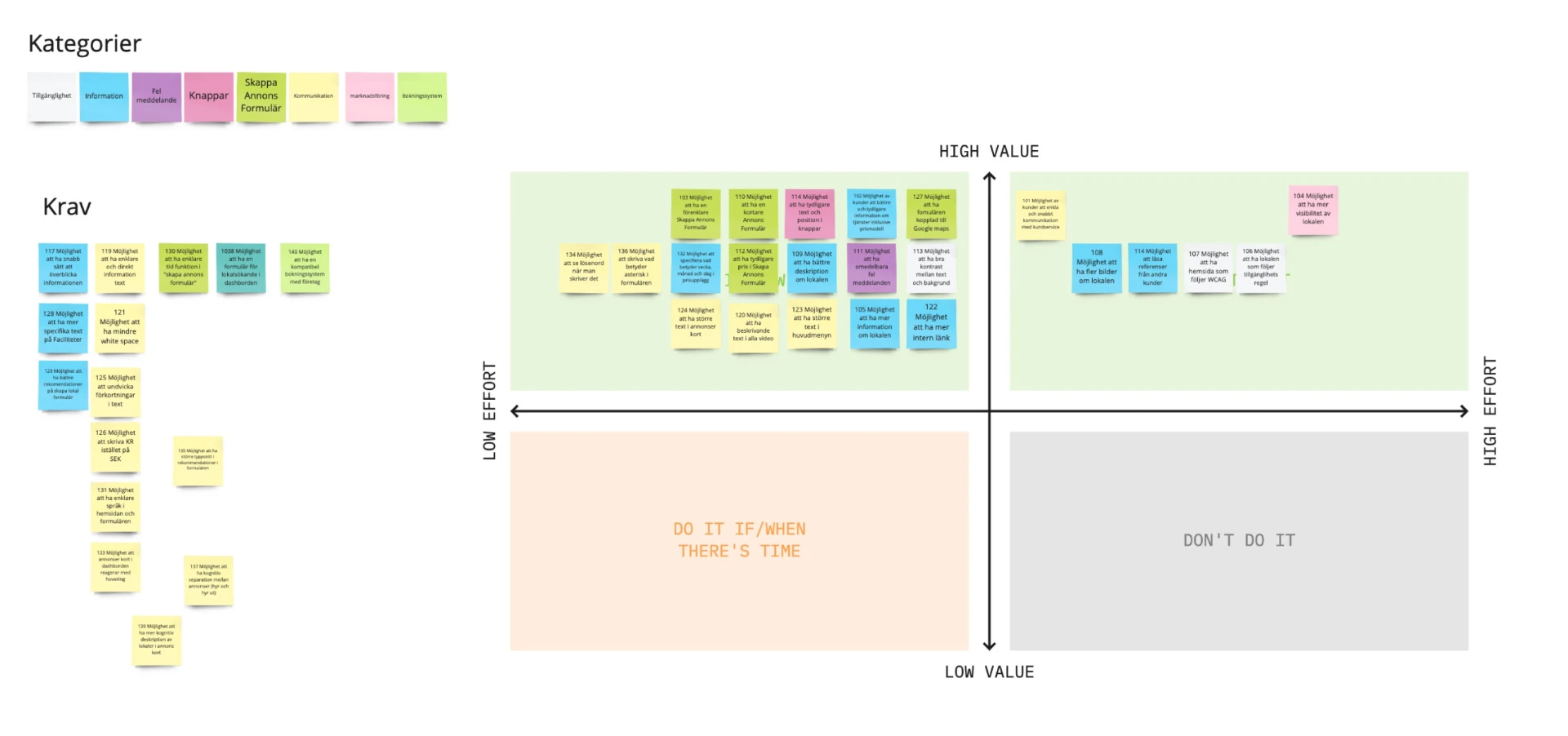
Design concept
Research led to three design principles that shaped every decision from here on:
A smooth process for advertising and booking
A one-step application form to create an ad, standardized minimum quality requirements for listings, and improved search with filters and accelerator buttons.
More information and assistance
Clearer recommendations for placing ads, and a full overhaul of the company and process-description pages, including transparent pricing and terms.
Fast, easy-access customer service
Support at every step of the renting process, with direct links to customer service placed at key moments on the webpage and dashboard.
UI and illustrations
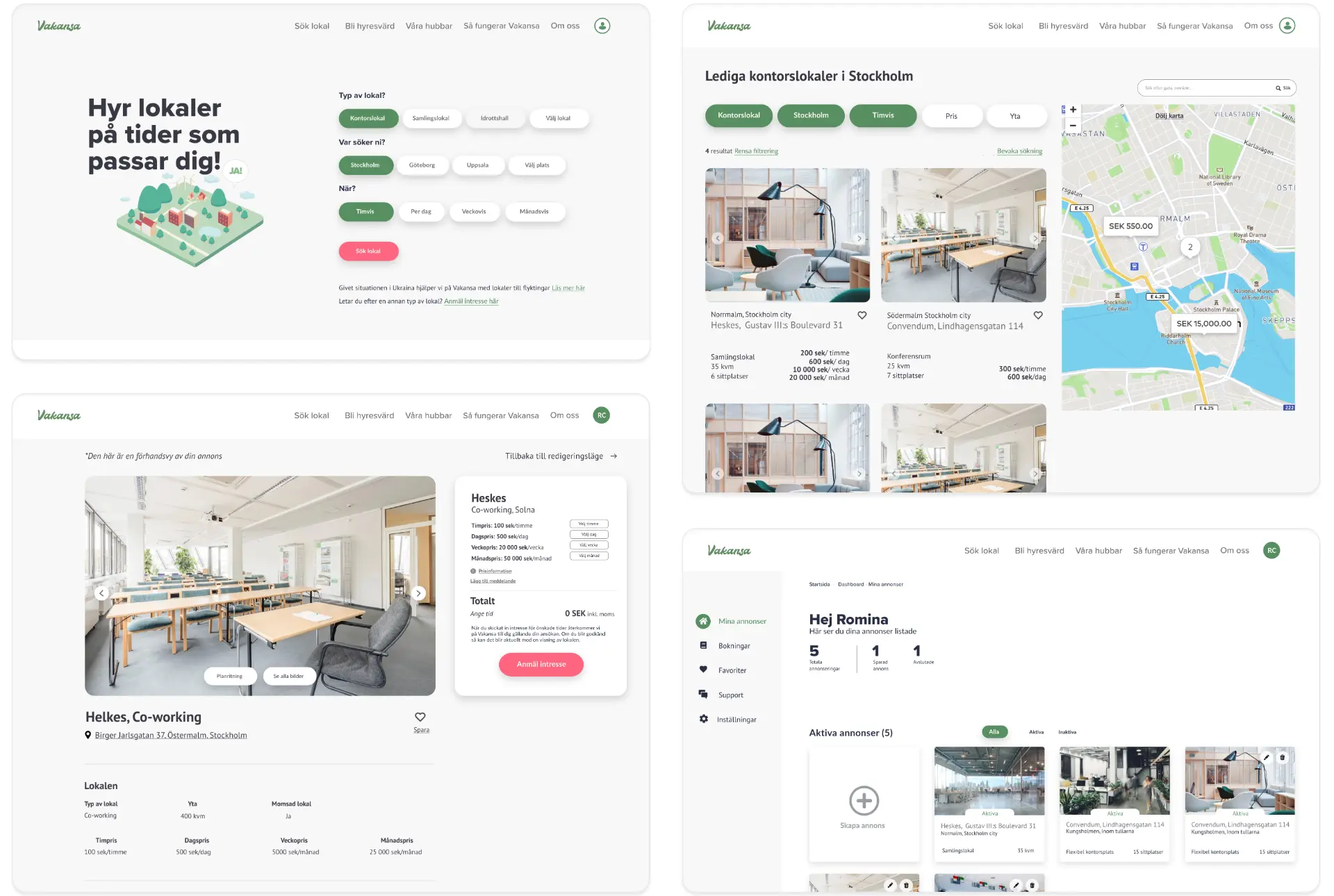
One goal of the redesign was to better align the platform's look with Vakansa's mission. To reflect its commitment to environmental sustainability, I selected green as the primary color, then built the rest of the palette, typography, and a set of minimalist, modern icons around it. I also created new illustrations depicting a vision of sustainable cities.
Prototyping & testing
I built a prototype in Adobe XD and used it for user testing. Since a prototype can't create real bookable spaces, testing at this stage was limited to specific flows, but the general impression from test subjects was positive: information was clear, the flow felt smoother, and the modern, minimalist style matched Vakansa's mission. Further testing was planned post-launch, particularly around the venue owner's calendar and booking process.
Next steps
The aim was a fast MVP launch. Planned next: a richer user dashboard with communication between renters and owners, an improved booking system, and an upgraded administrator dashboard.