Role: Product designer
Company: 12iD AB (2022 - 2024)
Project: Improvement of existing products, strategy and design of new features
Keywords: UX Research, Strategy, Requirements Management, Prototyping, UI, User testing
Background
12iD is an authentication solution that provides an all-in-one mobile solution for login, payments, and electronic signing.
As a lead designer, I am responsible for a variety of projects. Below I will go into further detail on four selected projects.
01 Democorp platform
The Democorp platform was designed to demonstrate to potential clients how the 12iD app would work with their systems. Democorp is both an online platform and an app, which are usually used by the Sales team in their Demo sessions.
Problem: when I was assigned to this project, the app crashed often. The Democorp platform was not responsive and not a suitable replacement for the app. My task was to make a new Democorp platform that is responsive, in the shortest time possible, so the Sales team could book Demos again.
Wireframing: Keeping a tight sync with the development team was essential to the success of this project. We held regular meetings to discuss our ideas and make decisions together. This ensured that everyone was on the same page and that the project stayed on track. As a result, the project was successfully implemented in just 3 weeks.
02 Admin Panel Platform
Another product in the 12iD ecosystem is Admin Panel, an online platform where the clients can approve and manage their customer's digital identities provided by the 12iD app.
Problem: The platform was originally designed by developers and it had usability issues, responsive problems, and didn't comply with the brand guidelines. Along with that, there were new features that needed to be implemented. My task was to create a roadmap for the development of the platform and make it more user-friendly, which included audit, testing, suggesting changes, and designing and prototyping the new features.
Usability Review & Research: After auditing and testing, I created a development strategy for the platform that prioritized usability improvements. I documented the issues I found and why they needed to be addressed, and I proposed suggestions with wireframes. I discussed my recommendations with the product team and we agreed on a plan of action.
Once the usability changes were implemented, we moved on to improving the platform's brand guidelines and responsiveness. In parallel, I also began planning a round of user tests. I created a user profile, questions, and scenarios for the test to ensure that we were meeting the needs of our users.
Prototyping & testing: I used Figma for the prototype, incorporating the suggested changes. This file will serve as a basis for future design tasks. I recruited people who matched the user profile and began the testing process. The testing is still ongoing and once it's finished I will use the feedback to make further improvements to the prototype.
03 React Native app
The React Native app is the central app at 12iD. It is meant to be used by clients of partner companies for onboarding, login, transactions, authentication and signing. My task is to continuously review it, test it, design new features and create a strategy for development.
Usability Review, Research & Strategy: I started by reviewing the app to familiarize myself with its features. As the app uses Machine Learning and Blockchain, I needed help from the team to understand the specifics of its functionality. This would help me to design solutions that took the app's capabilities into account. I analyzed and improved the Figma file after discussing with the team about misalignments with the app and unclear, and inefficient documentation. I created a preliminary list of requirements and gave it to the team.
I continued with the research part where I analyzed the competitors and their apps and suggested conducting qualitative research with end-users because none had been done previously. I created a plan for the methodology and recruitment, and I started the process, which is still ongoing. In the meantime, I have been assigned to design different features for the app such as improving the Recovery Details flow, Live Biometrics instructions and illustrations, and ID document frames for ML, among others.
04 Webpage
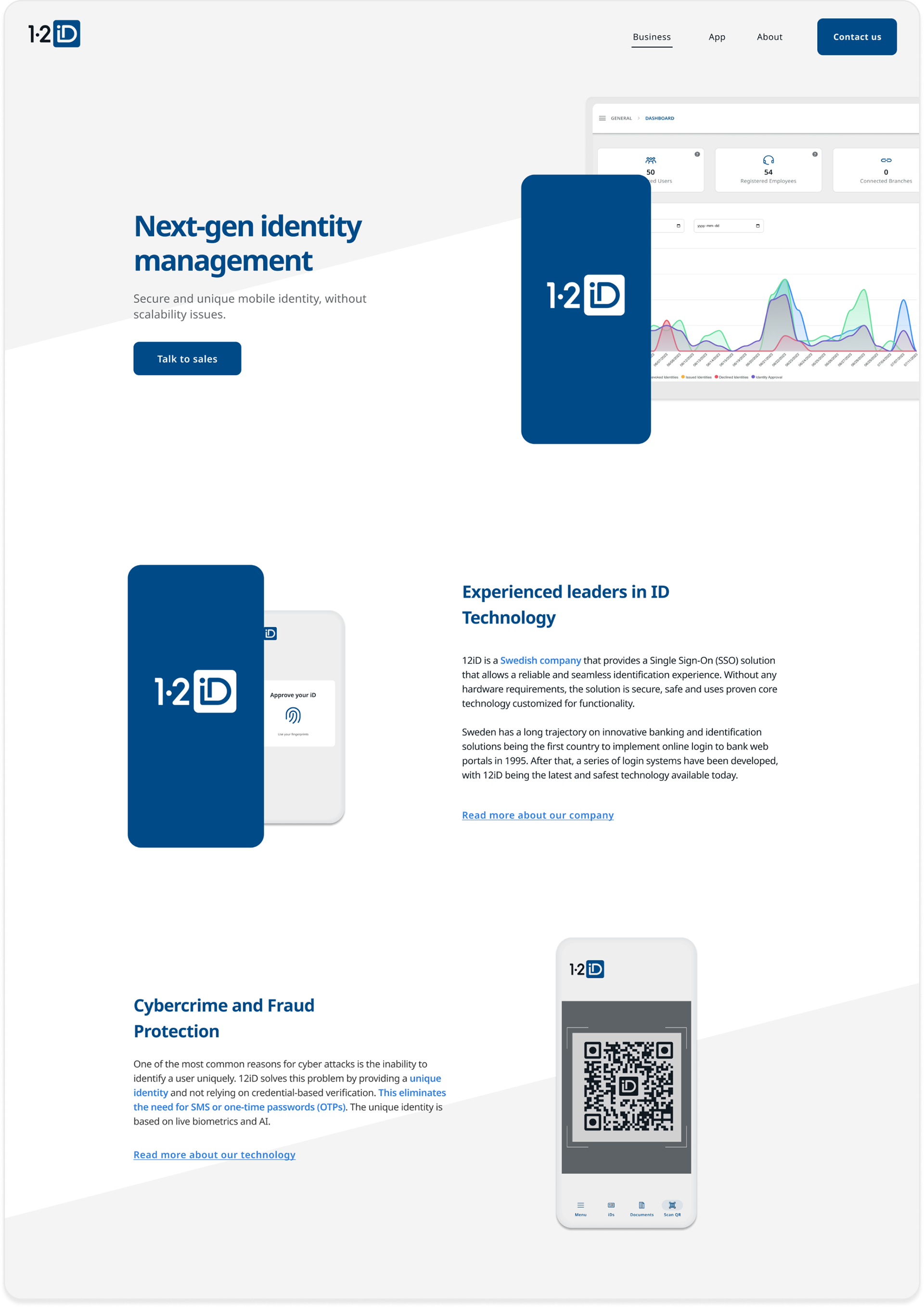
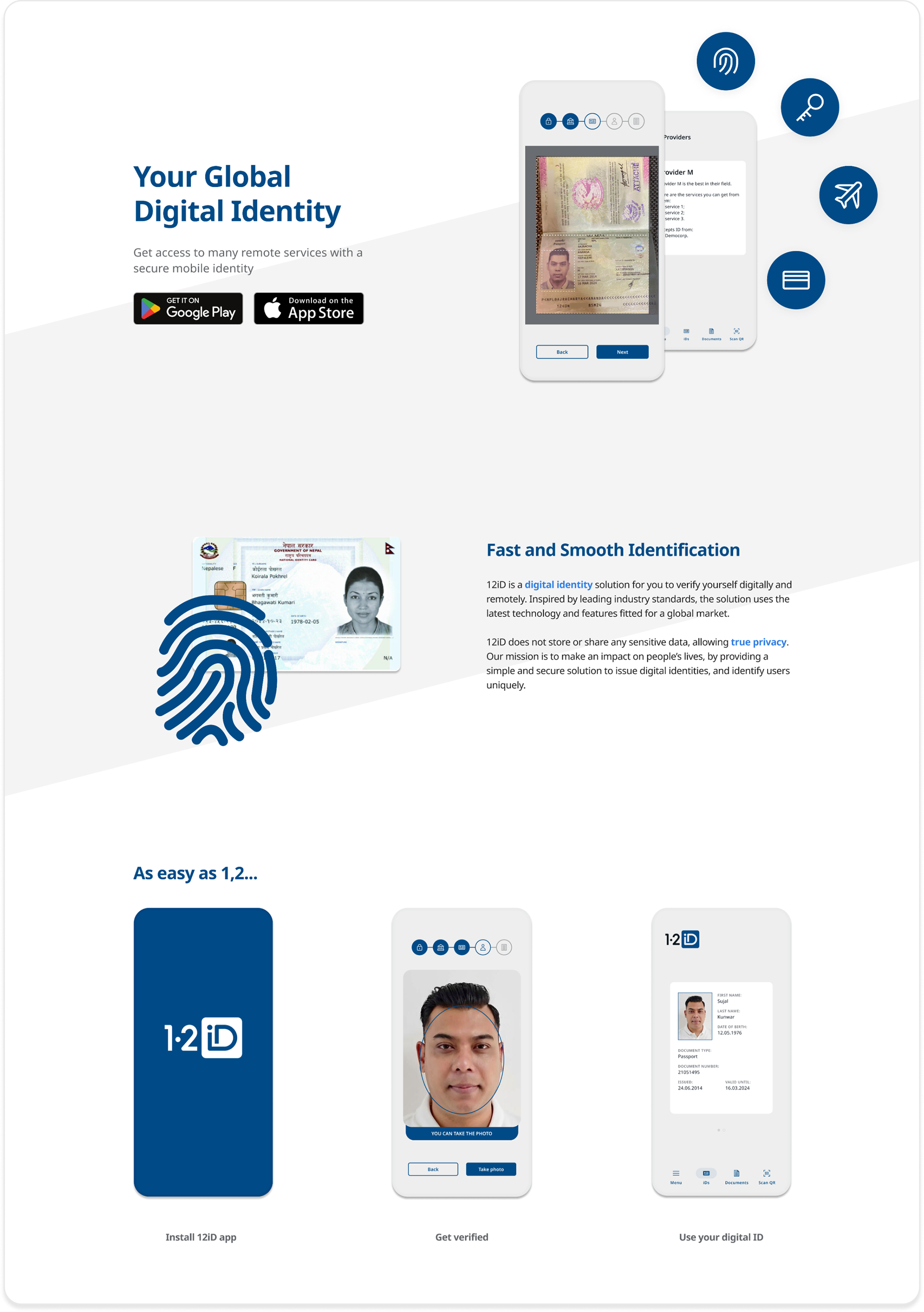
One of my latest projects was to update our website with the goal of making it clearer to potential clients about our technology, how our app works, and our company. I also wanted to make it more appealing to investors. My task is to design and implement the design into our Squarespace platform.
Research, Analysis & Prioritization: My first step was to define the users of our webpage. The primary users and targets are potential clients and investors. However, the page is also intended for potential employees and end-users of the app. I developed a strategy for qualitative and quantitative research based on interviews, surveys, observation, data analysis, and competitor analysis.
My goal was to understand what was unclear about the current information on the webpage, what was missing, and how we could improve it. I analyzed the qualitative data using an affinity diagram, which gave me clear insights into the main areas of concern for users. I also listed the opportunities and where they could be implemented on our webpage. Additionally, I created a list of requirements that gathered all of the information from my research and prioritized it according to value and time. I discussed the findings and prioritization with the CEO and sales team, and then began the design & update. The project is still ongoing.

